Navy blue Color is more than just a color—it’s a statement of elegance, confidence, and calm sophistication. Loved by designers, stylists, and brands alike, this deep hue represents trust, intelligence, and timeless appeal. From navy blue color combinations in modern interiors to navy blue branding colors in corporate design, it effortlessly balances professionalism with creativity. Its versatility allows it to pair beautifully with soft neutrals or bold accents, creating a perfect navy blue aesthetic for any visual style. Whether used in digital design, fashion, or home decor, navy blue color remains a classic choice that adds depth, harmony, and refinement to every artistic expression.
Navy blue color never goes out of style. Its rich depth and elegant tone make it one of the most versatile colors in design. From fashion to websites, navy blue color palettes blend sophistication with modern energy. This guide explores its meaning, mood, and perfect combinations that elevate every project with timeless beauty.
Understanding the Meaning and Power of Navy Blue Color
The meaning of navy blue color in design runs deeper than its dark tone. It represents trust, reliability, and sophistication. In color psychology, navy blue evokes calmness and control, making it ideal for professional and corporate branding. Major American companies like IBM and Chase Bank use navy blue color to signal authority and stability in their brand identity.
This navy blue aesthetic appeals because it feels grounded yet modern. Designers often use it in corporate branding, minimalist layouts, and digital products. Whether on a business logo, UI interface, or fashion piece, its calm navy blue mood creates confidence and elegance that lasts.
Navy Blue — The Anchor of Sophistication
Navy blue acts like an anchor in a color palette. It holds every tone together and balances the color harmony navy blue is known for. Its depth pairs well with warm shades like gold or coral and cool tones like gray or teal. That’s why it’s so popular in professional navy color schemes across industries.
The navy blue tone chart fits almost any brand, from high-end tech firms to interior design projects. In navy blue web design, the color becomes a base for contrast, where brighter colors stand out beautifully. It’s not loud, yet it leaves a lasting impression of authority and grace.
Brown — Earthy and Reliable
Brown and navy blue share a natural connection. Brown’s warmth balances navy’s depth, producing navy blue color combinations that feel grounded and trustworthy. In interior design, this duo creates a cozy and mature space, perfect for offices or living areas.
This color palette navy blue and brown works for luxury packaging, eco-friendly brands, and rustic designs. The brown tones act as the earth beneath navy’s ocean depth, forming a relationship that speaks of dependability and style.
Cream — The Soft Touch of Versatility
When cream and navy blue come together, they create a soothing and elegant atmosphere. The lightness of cream softens navy’s intensity, forming a navy blue and cream interior that feels balanced and airy. This duo reflects timeless charm in navy blue modern interiors and fashion branding alike.
| Color | HEX | RGB | Tone |
|---|---|---|---|
| Navy Blue | #001F3F | 0, 31, 63 | Deep Cool |
| Cream | #FFFDD0 | 255, 253, 208 | Soft Neutral |
Designers use this combination in corporate websites, product packaging, and editorial layouts. The navy blue neutral tones ensure readability while maintaining luxury aesthetics.
Soft Pink — Gentle and Inviting
Soft pink brings life to navy blue branding colors. It’s charming, modern, and slightly playful. In navy blue wedding palette inspiration, this pairing feels romantic yet polished. The deep blue anchors the softness of pink, creating emotional depth.
Fashion designers and creative directors love the navy blue and beige palette with a hint of pink for boutique brands and feminine UI layouts. It’s an expression of balance — strong yet gentle, mature yet modern.
Tips for Creating Navy Blue Color Palettes

Creating the perfect navy blue palette ideas requires balance and testing. Always ensure contrast by pairing navy with lighter or brighter tones like white or coral. This maintains accessibility and keeps visual hierarchy clear across mediums. Navy blue contrast colors make digital content easier to read and visually appealing.
When experimenting, use tools like Adobe Color or Canva navy blue palettes. Adjust hue, saturation, and brightness to refine the composition. Try your navy blue color generator in both light and dark mode to test its performance on screens and print materials.
How to Use Navy Blue Patterns in Design
In design, patterns elevate plain visuals into memorable experiences. Subtle navy blue patterns like gradients, lines, or dots add texture without overpowering content. These are common in stationery, packaging, and brand presentations.
In navy blue UI design, patterns create rhythm and depth. For websites, designers often use soft navy blue gradients in backgrounds to maintain focus while keeping an air of elegance and professionalism.
Integrating Colors in Web and Graphic Design
Navy blue web design thrives when it’s part of a well-structured system. Use it in headers, navigation bars, or backgrounds to create depth and trust. The combination of navy blue with white is one of the most reliable and professional looks in corporate sites.
Testing colors in Figma navy blue templates or LayersPilot tools helps you visualize balance. Many branding agencies rely on these tools to ensure that every tone remains consistent across logos, product packaging, and social media graphics.
Navy Blue Color Web Design Inspirations
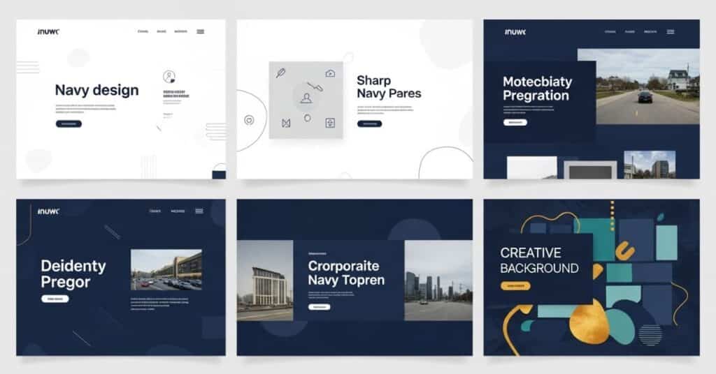
Many creative sites have mastered the navy blue design inspiration aesthetic. For instance, git-tower.com uses navy to project professionalism and clarity, perfect for tech products. On the other hand, LayersPilot blends navy blue with cream and pink, achieving harmony between innovation and creativity.
| Website | Style Focus | Why It Works |
|---|---|---|
| git-tower.com | Minimal & Tech | Uses navy for trust and depth |
| LayersPilot | Creative & Modern | Combines navy with cream & pink for balance |
Navy Blue Website Not Right for Your Organization?
Some brands might not align with a navy blue brand palette. Youthful, vibrant companies or entertainment businesses often prefer colors like teal or cobalt for a more energetic vibe. In such cases, choosing analogous navy blue colors with lighter tones ensures freshness without losing elegance.
More Navy Blue Inspired Color Palettes
Designers continue discovering creative navy blue color schemes every year. Some of the most admired combinations include Navy Blue + Gold + White, Navy Blue + Coral + Beige, and Navy Blue + Gray + Mustard. These mixes define moods from luxury to innovation and warmth to professionalism.
| Palette | Primary Colors | Mood / Usage |
|---|---|---|
| Classic Luxury | Navy, Gold, White | Premium branding and corporate design |
| Modern Energy | Navy, Coral, Beige | Lifestyle and social media branding |
| Corporate Calm | Navy, Gray, Mustard | Office interiors and business websites |
Such combinations appear frequently in navy blue creative palettes, giving brands and designers countless ways to express personality and balance.
Make Your Ideas Come to Life with LayersPilot

Testing colors before finalizing designs is vital. LayersPilot navy blue tools allow real-time generation and preview of palettes in both digital and print formats. Designers can check readability, harmony, and aesthetic strength instantly.
For marketing teams and web developers, this ensures cohesive visual identity. Experimenting with a navy blue palette generator on LayersPilot saves time while ensuring perfect results for every project.
The Beauty of Falling in Love with Blue
There’s something inherently timeless about navy blue. It carries the weight of history and the freshness of modern minimalism. The trust and sophistication navy blue evokes make it the backbone of successful design across industries — from fashion to digital design.
The versatility of the best navy blue shades proves why designers never tire of this hue. Whether it’s navy blue home decor, navy blue outfit combinations, or navy blue business branding, this color remains unmatched in style and meaning.
Final Thoughts
In a world flooded with colors, navy blue color combinations remain unbeatable for those seeking elegance and depth. It’s calm yet powerful, traditional yet forward-looking. By mastering how to create navy blue palette ideas, you can bring life, trust, and beauty to every creative project — one shade of blue at a time.
FAQs about Navy Blue
What colors go with navy blue for a website?
Navy blue works beautifully with white, gold, gray, and coral for websites. These colors balance its deep tone, creating a clean and modern look. Adding beige or light blue accents can also enhance contrast and readability while keeping the design elegant and user-friendly.
What is the best color to pair with navy blue?
The best colors to pair with navy blue are gold, white, and blush pink. Gold adds luxury, white brings clarity, and pink softens its strength. These combinations create perfect navy blue color palettes that suit both corporate and creative projects.
What color does not go with navy blue?
Bright neon tones like lime green or hot pink usually don’t complement navy blue. These shades overpower the calm navy tone and break the color harmony navy blue is known for, resulting in a clash instead of balance.
What color clashes with blue the most?
Pure orange often clashes with blue, especially when both are at full saturation. While they are complementary on the color wheel, their vibrancy can create tension if not balanced properly in a navy blue palette idea.
Do beige and navy blue go together?
Yes, beige and navy blue create a timeless, warm, and sophisticated pairing. Beige adds softness and neutrality, allowing the deep richness of navy blue to shine through. This combination works beautifully in navy blue home decor, websites, and brand visuals.

I’ve spent over 8 years working across SEO, WordPress development, Laravel, and UI/UX design, helping businesses improve their websites, search visibility, and overall digital presence. My experience includes on-page and off-page SEO, technical optimization, content strategy, WordPress development, and user-focused design for a range of clients and businesses.
Over the years, I’ve worked with teams including Skyray Ventures, Dotrefl, and ESPA Builders, combining technical development with digital marketing to deliver practical, measurable results.
I’m currently developing Laravel-based web applications at Princess Tourism while also growing LayersPilot, a digital services platform focused on SEO, web design and development, and website customer care.
One project I’m particularly proud of is Catch Head, an AI-powered lead generation platform developed by my team and presented at the Microsoft Imagine Cup at the national level.
I’m especially interested in SEO, Generative AI, prompt engineering, and AI-driven content strategy, and I enjoy connecting with businesses and professionals looking to strengthen their online presence through technology and search.