The Glass Effect CSS technique has become one of the most popular styles in modern UI design, transforming ordinary web interfaces into elegant, translucent surfaces that mimic real glass. This aesthetic, inspired by the glassmorphism design trend, adds depth, smooth lighting, and soft blur to create visually immersive layouts. Using CSS transparency, developers can layer elements that blend naturally with the background, enhancing both realism and sophistication. The result is a clean, futuristic appearance that improves readability and focus without clutter. Whether designing dashboards, landing pages, or apps, mastering the frosted Glass Effect CSS allows designers to elevate user experiences with style and precision.
Designers love UI/UX glassmorphism because it adds depth, realism, and focus to content. This trend balances aesthetic charm with usability. It emphasizes clarity while using layered translucent elements that allow backgrounds to gently show through. As part of the growing web design trends 2025, soft UI vs glassmorphism debates continue, but glassmorphism remains the favorite for its luxurious and minimalist touch.
Understanding the Visual Principles Behind Glass Effect CSS
At its heart, Glass Effect CSS meaning lies in blending translucency perception, blur, and light diffusion to simulate realistic glass surfaces. The design uses frosted panels with soft shadows and reflective edges, creating a depth illusion that feels tactile and responsive. When users interact, the layered transparency gives feedback through light and shadow, forming a visually dynamic experience.
Psychologically, people associate glass with clarity and sophistication. Research like the Singh and Anderson study 2002 explored how humans perceive translucency, showing that varying blur values CSS and opacity help simulate real-world materials. This effect enhances depth perception in UI and improves user focus, making futuristic web UI designs both engaging and familiar.
Essential CSS Properties for Glassmorphism

filter adds background blur, while rgba transparency controls light diffusion. The CSS box-shadow gives elements lift and realism, and gradient layers add sheen. Together, they form the base of any CSS glass effect.
Here’s a quick reference table showing how each property works:
| Property | Purpose | Example |
| backdrop-filter | Applies blur and brightness | backdrop-filter: blur(10px); |
| rgba() | Creates translucent colors | background: rgba(255,255,255,0.1); |
| box-shadow | Adds depth and shadow layering | box-shadow: 0 8px 32px rgba(0,0,0,0.2); |
| border-radius | Smooths edges | border-radius: 15px; |
Mastering these properties lets you craft glassmorphism CSS code that feels alive and modern.
Method 1 – Using Box-Shadow and Background-Color for Glass Effect
Creating the Next Level Glass Effect CSS begins with a mix of CSS box-shadow and semi-transparent backgrounds. When combined, they give a floating look, mimicking frosted glass CSS without heavy filters. The key is balancing light and shadow so that your layers maintain contrast.
This approach works best for dashboards or cards where performance matters. The CSS transparency softens edges, while shadows create separation. The result feels clean, smooth, and responsive — a perfect balance between realism and simplicity.
Example Code & Explanation
.glass-card {
  background: rgba(255,255,255,0.1);
  box-shadow: 0 8px 32px rgba(0,0,0,0.2);
  border-radius: 15px;
  border: 1px solid rgba(255,255,255,0.2);
}
This snippet adds layered depth and refined translucency — the foundation of a frosted glass effect in CSS.
Method 2 – Creating Blur Effects with Pseudo-Elements and Filter: Blur()
A more advanced approach to how to make glassmorphism in CSS uses CSS pseudo elements like ::before or ::after. These create an overlay that blurs only certain areas, resulting in layered transparency. The CSS blur effect makes the surface look softer while preserving background shapes.
This method gives designers fine control over transparent vs translucent design, offering a way to simulate real glass behavior. It’s especially effective in banners, modals, and responsive glassmorphism layouts.
Step-by-Step Code Example
.glass-effect::before {
  content: "";
  position: absolute;
  inset: 0;
  backdrop-filter: blur(12px);
  -webkit-backdrop-filter: blur(12px);
  border-radius: inherit;
}
This step-by-step glassmorphism CSS tutorial showcases the power of the CSS backdrop-filter explanation when combined with layering techniques.
Method 3 – Simulating Light Sheen and Reflection
Light is essential for realism in modern UI design with glassmorphism. By adding gradients or highlights, you can simulate reflection — that subtle sparkle when light hits polished surfaces. This technique makes frosted glass vs shadow depth more believable, elevating simple layouts into premium experiences.
Designers can use gradients to control where light appears to hit, adjusting opacity in design for dynamic results. It gives the illusion of smooth movement when users scroll or hover, ideal for futuristic web UI projects.
CSS Example with Gradient Sheen
.sheen {
  background: linear-gradient(120deg, rgba(255,255,255,0.3), rgba(255,255,255,0));
}
This CSS gradient sheen example adds realistic reflection and turns flat layers into glowing glass panels.
Using Backdrop-Filter for Realistic Glassmorphism (Modern Method)
The CSS backdrop-filter is the most powerful tool for how to create frosted glass effect with CSS. It blurs content behind an element, producing authentic transparency. The backdrop-filter blur tutorial reveals how combining blur with brightness and contrast settings enhances realism and texture.
However, browser support differs. Chrome and Safari handle it well, while older browsers need fallbacks using CSS blur vs filter: blur() tricks. Performance can be improved through GPU rendering and minimal hardware acceleration, keeping animations smooth.
Accessibility and Usability Considerations
Designers must ensure accessible glassmorphism by following WCAG contrast ratio guidelines. Readability on translucent backgrounds is crucial for user comfort. Always test different lighting conditions and text contrast to maintain clarity. If users find it hard to focus, provide a reduce transparency option to simplify visuals.
When creating accessible UI effects, consider users with motion sensitivity. Subtle transitions and controlled depth improve user comfort and visibility. The goal is to blend style with function — not sacrifice usability for looks.
Practical Design Tips for Implementing Glassmorphism
In real projects, design with glassmorphism in dashboard or web apps needs planning. Keep only a few translucent elements per layout to avoid clutter. Combine glassmorphism vs neumorphism for layered realism. Light shadows and muted colors help preserve legibility and aesthetic balance.
The glassmorphism generator tools online can help find ideal blur values CSS and opacity. For example, most designers prefer 5–15px blur and 0.05–0.2 opacity for balance. These numbers keep your glassmorphism effect for cards and buttons consistent and elegant across screens.
Common Mistakes to Avoid When Creating Glass Effects
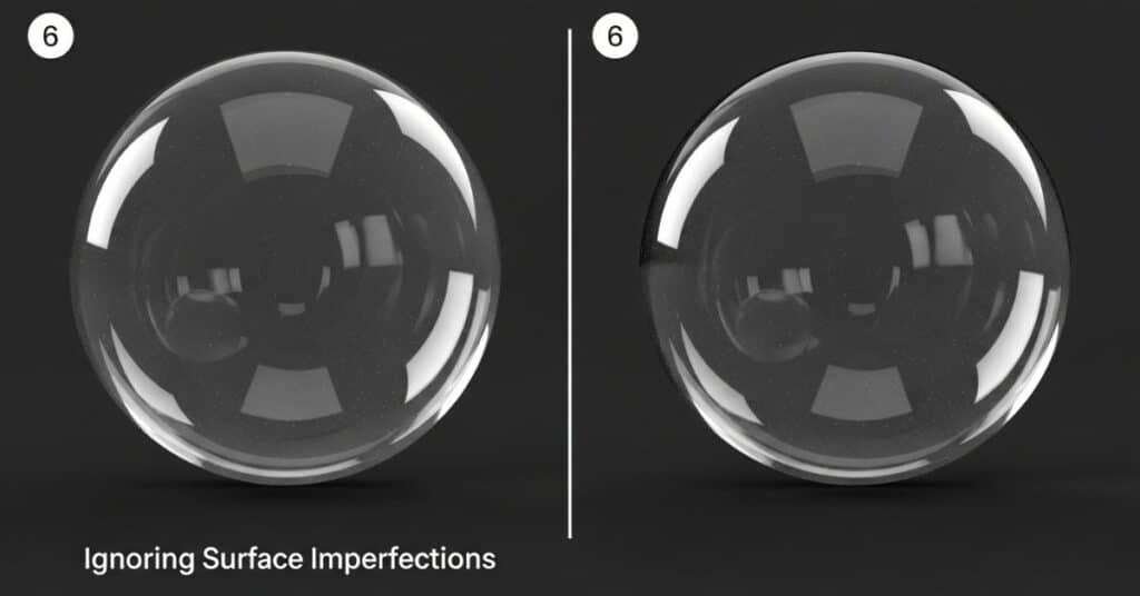
Some beginners overuse blur or add too much transparency. Too much CSS blur effect can make content look muddy and reduce visual depth perception. Overlapping frosted panels with poor contrast breaks clarity, making text unreadable.
Avoid mixing too many colors. Stick to minimalistic transparent design principles. Balance light, shadow, and spacing for harmony. Remember, the best glassmorphism website examples 2025 focus on subtlety and refinement — not visual chaos.
Future of Glassmorphism in Web Design
The future of glassmorphism lies in advanced CSS performance tips and evolving design tools. With CSS color mixing and dynamic filters, designers can build modern minimalism and flat glass look interfaces that feel futuristic. Frameworks like Tailwind and Framer are already integrating these enhancements for faster workflows.
As AI-driven tools mature, expect UI design 2025 to blend soft UI vs glassmorphism seamlessly. Interactive depth, fluid transparency, and user-customized effects will redefine digital aesthetics for years to come.
Final Thoughts – Bring Depth and Elegance to Your Interfaces
Creating Next Level Glass Effect CSS is more than a style — it’s an art. Whether you use Figma or a glassmorphism generator, the goal is to blend light, color, and blur to create meaningful depth. Use the realistic glass effect CSS snippet as your foundation, then refine every element for visual harmony.
As you experiment, focus on balance, accessibility, and innovation. With these principles, your designs will look elegant, futuristic, and ready to lead the next wave of web design trends.
FAQs
How to give glass effect in CSS?
Use backdrop-filter: blur(10px); with rgba(255,255,255,0.1) and shadows for a realistic glass look. This combination forms the base of the CSS glass effect.
How to do glassmorphism in CSS?
Add layers of CSS transparency, blur, and borders. Adjust blur values CSS between 5–20px for the best balance between clarity and depth.
How to give transparent effect in CSS?
Use rgba transparency. For example, background: rgba(255,255,255,0.1) makes the surface translucent while retaining visibility of elements behind it.
How to make a glass button in CSS?
Combine backdrop-filter, soft box-shadow, and rounded corners. Adding a CSS gradient sheen helps simulate reflection on the button surface.
What color is rgba(0,0,0,0)?
It’s fully transparent black — invisible to the eye but essential for controlling opacity in design. It’s commonly used in layering frosted glass CSS effects.

I’ve spent over 8 years working across SEO, WordPress development, Laravel, and UI/UX design, helping businesses improve their websites, search visibility, and overall digital presence. My experience includes on-page and off-page SEO, technical optimization, content strategy, WordPress development, and user-focused design for a range of clients and businesses.
Over the years, I’ve worked with teams including Skyray Ventures, Dotrefl, and ESPA Builders, combining technical development with digital marketing to deliver practical, measurable results.
I’m currently developing Laravel-based web applications at Princess Tourism while also growing LayersPilot, a digital services platform focused on SEO, web design and development, and website customer care.
One project I’m particularly proud of is Catch Head, an AI-powered lead generation platform developed by my team and presented at the Microsoft Imagine Cup at the national level.
I’m especially interested in SEO, Generative AI, prompt engineering, and AI-driven content strategy, and I enjoy connecting with businesses and professionals looking to strengthen their online presence through technology and search.