In CSS, EM to REM conversion plays a vital role in building flexible and accessible layouts. These CSS length units allow designers to control sizing that adapts seamlessly to different devices. While EM depends on its parent’s font size, REM references the root font-size in CSS, providing consistency across all elements. This distinction improves responsive typography, ensuring content stays readable no matter the screen size. By learning how to convert EM to REM, developers achieve better scalability, maintain cleaner code, and follow CSS accessibility best practices. Understanding this relationship is the foundation for modern web design scalability and responsive layouts.
Designers and developers often struggle to keep text and layout consistent across devices. The EM to REM converter solves this problem by helping you translate scalable units easily. If you’ve ever wondered about EM vs REM in CSS, or how to convert EM to REM in CSS, this guide explains everything. You’ll learn how relative units in CSS affect responsive typography, accessibility, and performance.
What Is an EM to REM Converter?

An EM to REM converter helps you change element-relative values into root-relative ones. It ensures consistent sizing and alignment in your projects. When working on responsive designs, this converter makes scaling faster and avoids the need to calculate font sizes manually.
It’s also vital for web design scalability. By converting EM to REM, you align your entire website with CSS font-size scaling. It gives designers predictable outcomes, especially when working with multiple themes and layouts. The converter supports modern responsive design with EM and REM principles.
What Are EM Units in CSS?
“em” means “element-relative unit”, and it changes size based on its parent. If a parent font size is 16px, 1em equals 16px. But if the parent is 20px, then 1em equals 20px. That’s how EM values depend on parent font-size. This flexibility is why EM is common in modular scaling in web design.
However, the compounding problem of EM units can appear when elements are nested. Each child inherits scaling from its parent, sometimes leading to oversized text. So, when using EM units, watch for CSS inheritance and compounding effect that may alter layout unexpectedly.
What Are REM Units in CSS?
“rem” stands for “root em” and always relates to the root element font scaling. If the browser default font size 16px, then 1rem equals 16px. Unlike EM, REM doesn’t depend on parent elements, so REM values depend on root element. This gives you consistent control across the entire page.
Developers prefer REM because REM provides consistent scaling. It’s easy to predict how text or spacing will look. You can change everything at once by editing the root font-size in CSS—ideal for maintaining CSS accessibility best practices and keeping your design predictable.
Difference Between EM and REM (EM vs REM)
The difference between EM and REM lies in what they reference. EM depends on parent size; REM depends on the root. This affects how your website scales across devices and components. When choosing between relative vs absolute units, REM offers more stability, while EM offers flexibility.
| Property | EM | REM |
| Reference | Parent font-size | Root (HTML) font-size |
| Scaling | Local | Global |
| Predictability | Medium | High |
| Use Case | Components | Layouts |
Choosing between them depends on project needs. REM works best for CSS responsive layout units, while EM is better for component-level adjustments.
Why Convert EM to REM and Vice Versa
Developers convert EM to REM when they need consistent scaling across a website. It avoids issues caused by parent dependencies. In contrast, converting REM to EM is helpful for isolated modules that need EM gives modular flexibility in containers or widgets.
Switching between them improves accessibility. It supports Accessibility and scaling in CSS by allowing users to resize text easily. These conversions are part of CSS best practices for modern design, ensuring your layouts remain responsive and inclusive.
EM to REM Conversion Formula and Table
The CSS units conversion formula is simple. 1rem = root font-size and 1em = parent font-size. To convert EM to REM, use:
Formula:
value_in_rem = value_in_em × (parent_font_size / root_font_size)
Here’s a quick conversion chart assuming HTML element base font size of 16px:
| EM | REM | PX |
| 0.875em | 0.875rem | 14px |
| 1em | 1rem | 16px |
| 1.25em | 1.25rem | 20px |
| 1.5em | 1.5rem | 24px |
This table helps you keep track of sizes when managing responsive web design units.
How to Use Our Online EM to REM Converter Tool
Using an EM to REM calculator is simple. Enter the EM value, the parent font size, and the root font size. The tool instantly gives you the REM equivalent, saving time and improving workflow.
Our CSS unit conversion tool supports both directions—EM to REM and REM to EM. It’s ideal for teams optimizing frontend performance and testing mobile-friendly CSS scaling. You can use this interactive EM REM calculator directly within your design system.
REM to EM Conversion Explained
Sometimes you’ll want to convert CSS font units the other way. To get EM from REM, reverse the formula. This conversion helps when working on nested elements needing local adjustments.
Understanding the Root em vs element em relationship is key here. EM depends on parent context, while REM depends on root. Both are part of responsive typography methods that scale smoothly across screen sizes using CSS media queries font-size control.
Practical Use Cases of EM and REM in Web Design
In practice, developers use REM for page-wide scaling. It helps create consistent CSS typography scaling. For example, if you set your root font-size in CSS to 10px using the CSS 62.5% technique, you can easily calculate 1rem as 10px.
Use EM when building isolated widgets or navigation menus. These need local control over spacing and size. Combining both methods gives balanced web accessibility standards WCAG and frontend performance optimization in any project.
Common Problems When Working with EM and REM
The most common issue with EM is scaling errors. The compounding problem of EM units causes nested elements to grow unexpectedly. It’s important to test across devices and validate using CSS accessibility best practices.
With REM, issues arise if you hardcode the root font-size in CSS using pixels. Instead, use percentages or relative scaling. The 62.5 percent font-size technique CSS helps maintain proportional scaling while respecting accessibility in front-end development.
EM vs REM in Modern CSS Frameworks
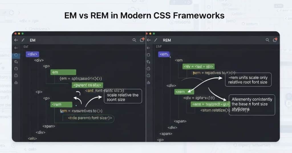
Most CSS frameworks using REM (Bootstrap, Tailwind, Material UI) adopt REM because it’s predictable. It provides CSS root element styling consistency and works well with modern frontend frameworks that rely on tokens and variables.
Still, EM remains useful for modular elements like sidebars or buttons. Mixing both within a single project enhances responsive web design units and encourages more adaptable layouts.
1) Manual formula (fast and precise)
Use the identity 1rem = rootFont and 1em = parentFont. Convert with:
rem = em × (parentFont / rootFont)
em  = rem × (rootFont / parentFont)
If rootFont = 16px and parentFont = 20px, then 1.2em → 1.2 × (20/16) = 1.5rem.
2) “62.5%” root baseline for easy math
Set html { font-size: 62.5%; } so 1rem = 10px on browsers with 16px defaults. Now px ↔ rem becomes mental math: 24px = 2.4rem. Convert existing em by first resolving to px, then divide by 10.
3) CSS Custom Properties as a live converter
Define the relationship once and reuse it:
:root { --root: 16; }           /* px */
.widget { --parent: 20; }       /* px */
.widget { font-size: calc(1.2 * var(--parent) / var(--root) * 1rem); }
Change --parent or --root and every computed rem updates automatically.
4) calc() bridges contexts without rewriting
When you inherit an em-based spec but want rem output, embed the ratio:
.button { /* 1.1em in a 18px parent, root 16px */
  font-size: calc(1.1 * 18 / 16 * 1rem);
}
Keep design intent while targeting rem at compile time.
5) Tiny JS helper for design systems
Normalize tokens on build or at runtime:
const toRem = (em, parent, root=16) => (em * (parent/root)).toFixed(4) + 'rem';
toRem(1.25, 18); // "1.4063rem"
Pipe Figma/JSON tokens through this to guarantee consistent rem output.
6) PostCSS transform (automate the whole repo)
Create a custom PostCSS plugin (or use a value processor) to rewrite em() to rem:
/* input */
.card { padding: em(1.5, 18); }
/* output (root 16) */
.card { padding: 1.6875rem; }
Enforce at commit time with a pre-commit hook.
7) Sass/SCSS function for authoring-time conversion
Keep authors productive while shipping rem:
@function em-to-rem($em, $parent, $root:16) {
  @return ($em * ($parent / $root)) * 1rem;
}
.title { font-size: em-to-rem(1.2, 20); } // 1.5rem
Pair with a rem-to-em() for round-trips during refactors.
8) Token pipeline using Style Dictionary
Store one truth in px, export multiple platforms:
- Input:
font-md = 18px - Web rem transform (root=16):
18/16 = 1.125rem - Native iOS/Android keep
18
This yields consistent UI across web and apps while authoring once.
9) Linting guardrails to prevent regressions
Adopt rules like:
- “Prefer rem for typography and spacing”
- “Allow em only in component internals”
Use Stylelint with custom rules to flag rawemoutside allowed files. CI fails on violations so the codebase stays normalized.
10) DevTools audit & quick conversions
In Chrome DevTools, hover computed values to see px equivalents. Validate your mapping by toggling page zoom and changing html { font-size } in the Elements panel. If modules balloon, your em chain is compounding—convert that segment to rem.
11) Framework-level normalization (Tailwind/Bootstrap/MUI)
Set a clear base and let the framework generate rem scales:
- Tailwind: adjust
theme.fontSizeand root size; utilities emit rem. - Bootstrap: variables already use rem; keep tokens in rem.
- MUI: set
typography.htmlFontSizeto align your rem math.
Result: automatic, predictable rem across components with minimal hand work.
Try Our Other CSS Unit Converters
You can explore more tools like PX to REM, PX to EM, and Percent to REM. These tools help convert between relative vs absolute units quickly. Use the Responsive CSS converter to make scaling consistent across every component, and check out our font-size converter online for precision work. All these tools complement the EM to REM converter to achieve flawless scalable font units in responsive projects.
Conclusion
Understanding EM vs REM in CSS gives you true control over design scalability. Both units are part of modern responsive web design units, and when used correctly, they create consistent, readable, and accessible interfaces. The EM to REM converter bridges the gap between flexibility and precision, letting you switch between CSS scalable units easily.
REM ensures predictable results because REM values depend on root element, while EM offers flexibility since EM values depend on parent font-size. Combining both makes your layout adaptive yet stable. Whether you’re focusing on CSS accessibility best practices, responsive typography, or maintaining web design scalability, mastering these units will improve every project you build.
The key takeaway is simple: use REM for global consistency and EM for modular customization. Together, they make your website future-ready, accessible, and aligned with modern frontend performance optimization and CSS best practices for modern design.
FAQs About EM and REM
What is EM and REM?
In CSS, EM and REM are relative units in CSS used for sizing text and elements. “em” means “element-relative unit”, which scales according to its parent element’s font size. “rem” stands for “root em”, which scales according to the root font-size in CSS defined on the HTML element. Both support responsive typography and improve accessibility and scaling in CSS.
Is EM the same as REM?
No, EM and REM behave differently. EM values depend on parent font-size, meaning they can change in nested elements. REM values depend on root element, so they stay consistent across the page. This difference prevents the compounding problem of EM units that can cause unpredictable scaling.
What is 1 REM equal to?
One REM equals the root element font scaling value. For example, if the browser default font size 16px, then 1rem = 16px. Changing the HTML element base font size (for example, to 10px using the CSS 62.5% technique) makes it easy to calculate REM-based measurements throughout your design.
Is 5 REM the same as 5000 millirem?
No, REM in CSS length units has nothing to do with the radiation unit “millirem.” In web design, 5rem refers to five times the root font-size in CSS, not a physical measurement. So, if the root is 16px, 5rem equals 80px, representing CSS relative length values, not radiation levels.
What is 24 PX in REM?
You can find this using the CSS units conversion formula. If the root font-size in CSS is 16px, divide 24px by 16px: 24 ÷ 16 = 1.5rem. So, 24px = 1.5rem. This formula makes responsive design with EM and REM simpler and ensures precise sizing in your layout.

I’ve spent over 8 years working across SEO, WordPress development, Laravel, and UI/UX design, helping businesses improve their websites, search visibility, and overall digital presence. My experience includes on-page and off-page SEO, technical optimization, content strategy, WordPress development, and user-focused design for a range of clients and businesses.
Over the years, I’ve worked with teams including Skyray Ventures, Dotrefl, and ESPA Builders, combining technical development with digital marketing to deliver practical, measurable results.
I’m currently developing Laravel-based web applications at Princess Tourism while also growing LayersPilot, a digital services platform focused on SEO, web design and development, and website customer care.
One project I’m particularly proud of is Catch Head, an AI-powered lead generation platform developed by my team and presented at the Microsoft Imagine Cup at the national level.
I’m especially interested in SEO, Generative AI, prompt engineering, and AI-driven content strategy, and I enjoy connecting with businesses and professionals looking to strengthen their online presence through technology and search.